SMP Press
Sheet Music Plus is a self publishing platform for musicians to publish and sell their arrangements of originals, songs in the public domain, and a selection of copyrighted songs.
My Roles
- User Research
- User Experience Design
- Visual Design
- Front End Development
Tools
- Invision
- Sketch
- Sublime Text / Atom
- Bootstrap 4 / SCSS
- Ember.js
Problem
We needed to drive sign ups and submissions on the site. Our users are pretty small subset of the population i.e. musicians that read, write and create sheet music. In order to increase conversions and get users to submit their work, we had to provide a well rounded experience on all fronts.
Dashboard
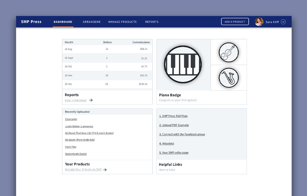
Based on our research and analytics, the first thing our users want to see when they log in to see is their sales reports. The alarming number of customer service emails necessitated we were more thorough in explaining the legality of the program. We achieved both objectives with a monthly sales summary and help questions linked to right from the first page they see when they logged in.
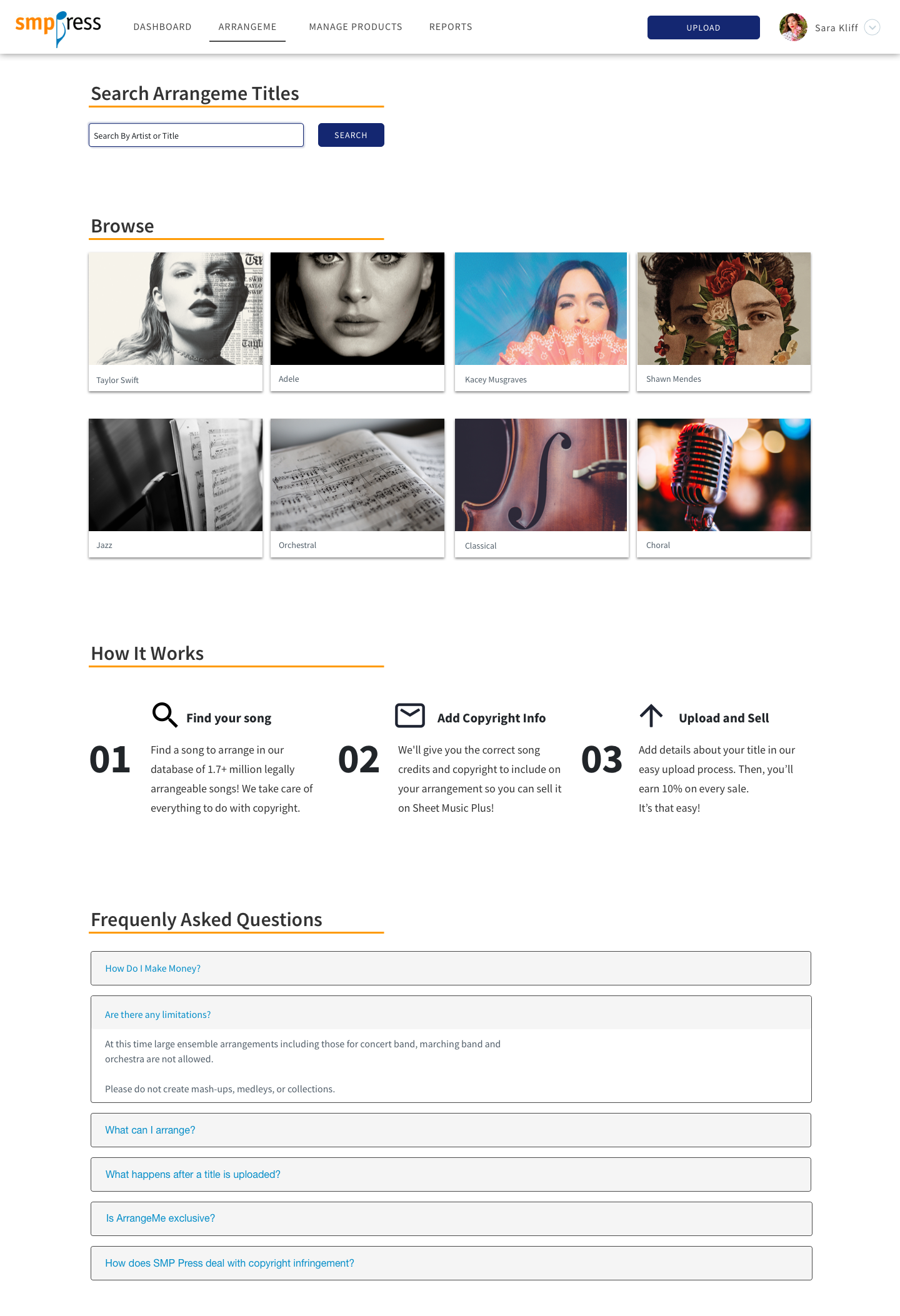
Search Results
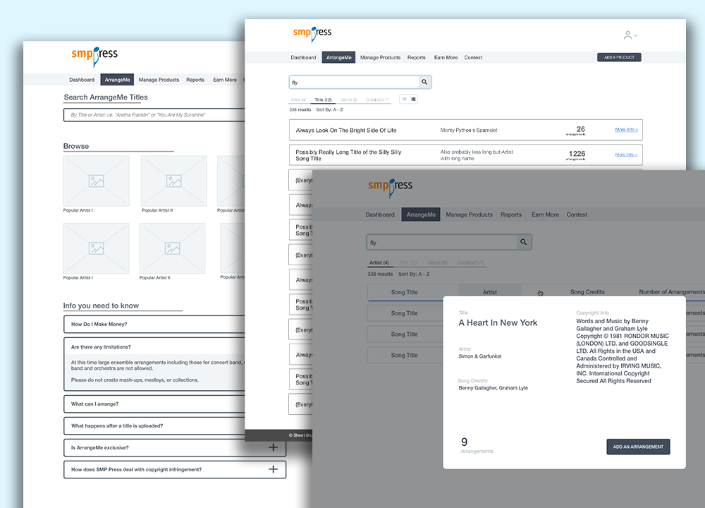
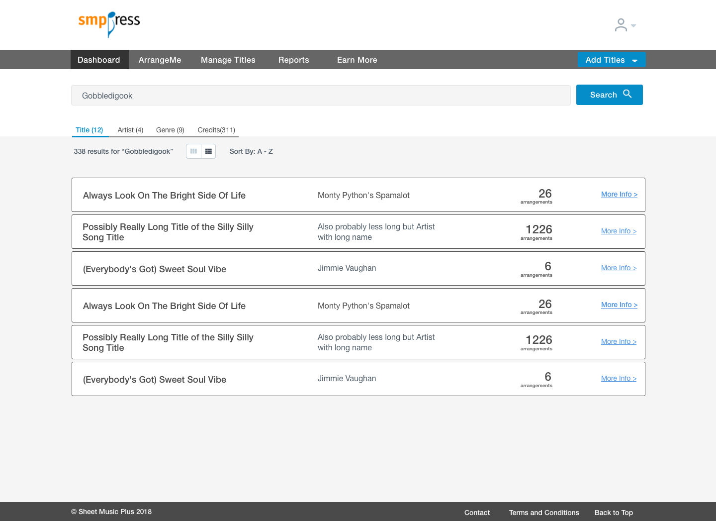
The search results are specifically for copyrighted songs. This part of the program is the main driver of submissions and revenue. It's the only one of it's kind and has made over a million dollars for the company. It also comes with a lot of questions and uncertainty from users.
There are two main use cases:- 1. the user has a song they've arranged and want to upload it.
- 2. the user wants to find a song to upload.
Our job is to make sure the user has the correct copyright information on their music in addition to uploading it to the correct title. Since the technology to check the user's PDF isn't available, the honor system is in place. The design had to remind users how the program worked and, most importantly, that it is legal. The next step was to guide them to their song via sortable & filterable results.
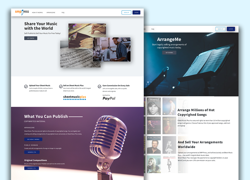
Marketing Site
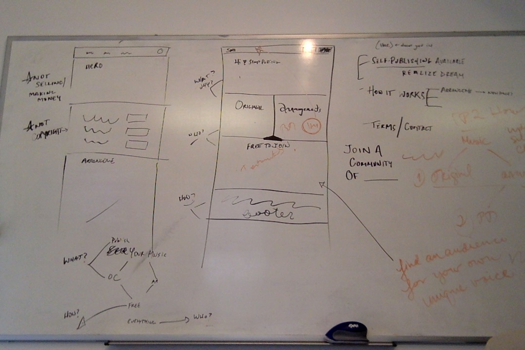
SMP Press never had a formal UX person work on it until I arrived. In order to get more sign ups and submissions, our first impression had to be vastly improved. When I first encountered the first version, I couldn't get my head around what the program was or how it worked. The hardest part was finding consice language to fit the hierarchy we had in place from a business perspective. I worked the marketing team to perfect the tone and verbage.
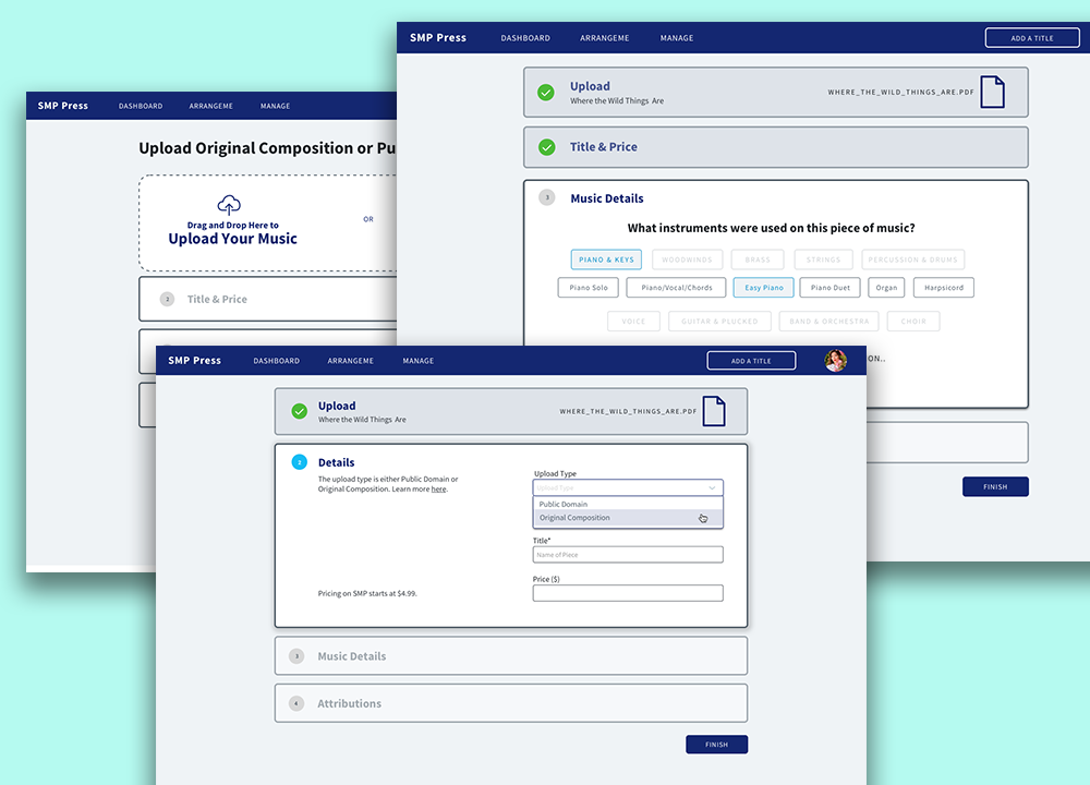
Forms
SMP Press relies on user generated content to bring in revenue an keep the lights on. Before I arrived, the form was four times as long as the one you see here complete with a giant cluster or checkboxes. My goal was to move the user through the necessary sections with an understanding of their progress. In order to make it delightful and easier to navigate, I added colored-coded drill downs, and hide/show simple animations.